
Hello, and welcome to Style Imitating Art’s “Reveal Monday”. Today is the day that the hosts, unveil our interpretations of the chosen artwork.
What Is Style Imitating Art?
Style Imitating Art is hosted by Salazar of 14 Shades of Grey, Shelbee of Shelbee on the Edge, and me. Style Imitating Art challenges us to draw style inspiration from pieces of art. Every other Monday one of us selects an inspiration image and we each post the image on our blogs. The following Monday we share our art-inspired outfits. The following Wednesday, the curator shares all of the submissions on her blog.
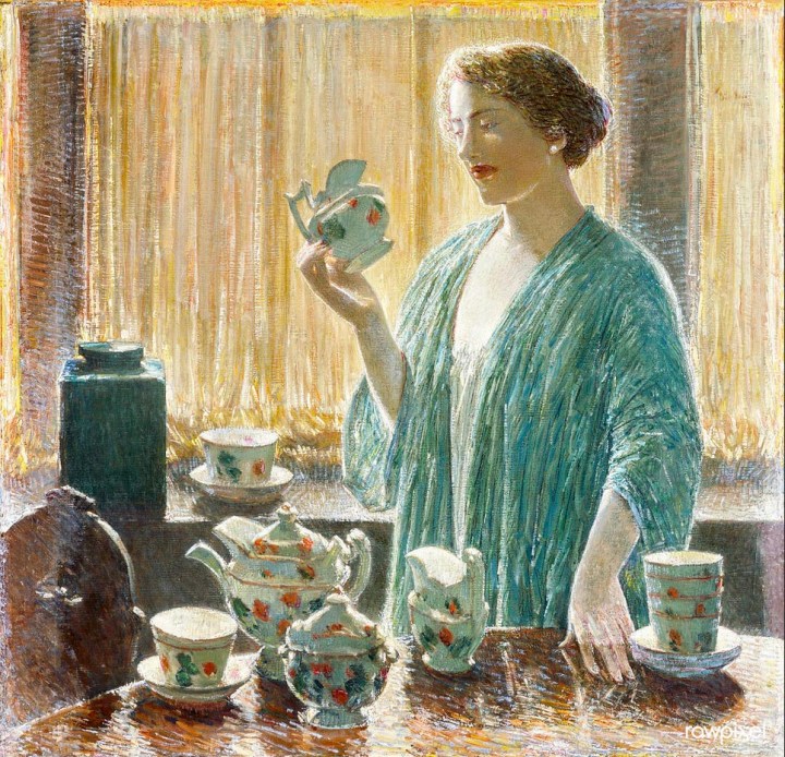
That would be me. Last Monday, I first presented Childe Hassam’s “Strawberry Tea Set.” I had always known about Childe Hassam because one of his flag series paintings is on a book about American artists that I have had for years. A couple of weeks ago, I decided to do some research on him and discovered his open window paintings.
In these paintings, a lone woman is usually dressed in a Kimono with a window behind her. This window can be open to the outside or covered with a thin, semi-opaque curtain that lets light in. Generally, not too much of the interior room showing. There is usually a table on which light can be reflected.
There are so many gorgeous paintings in this series! “The Strawberry Tea Set”, which was painted in 1912, won because I just like the turquoise, white, and browns that combine into a very soothing scene.
My Take With Color Blocking
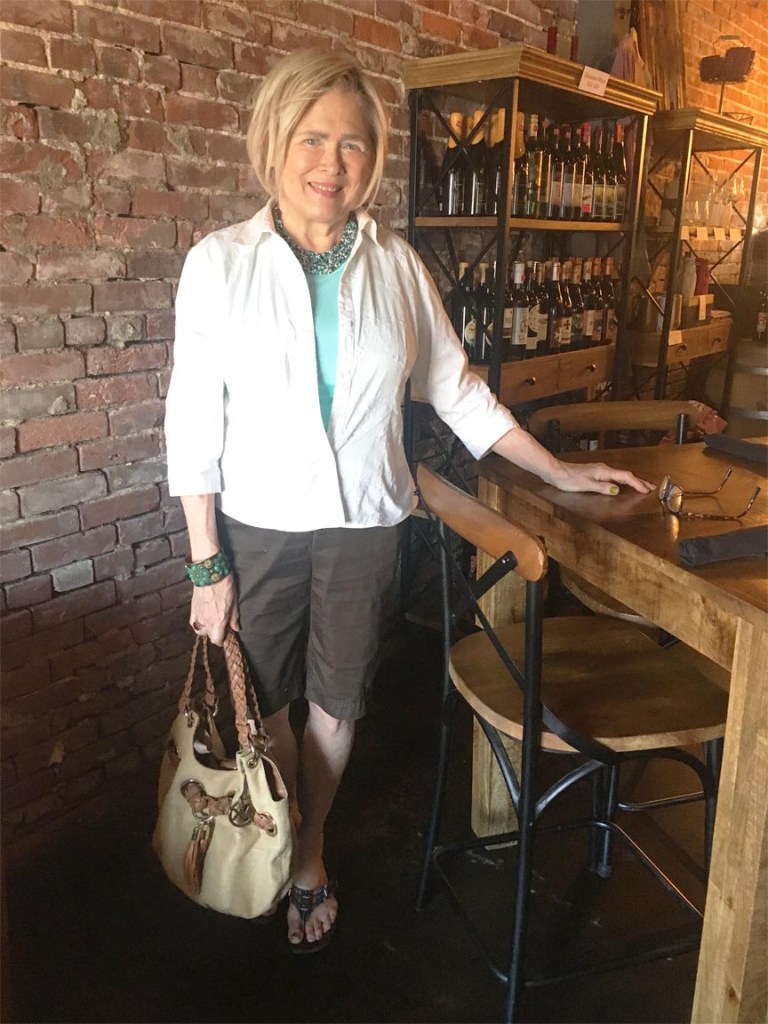
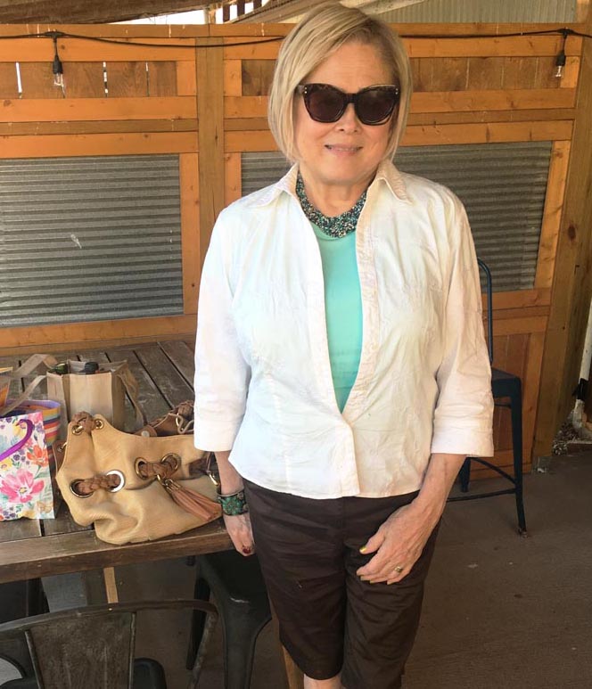
As most of us do, I made this painting interpretation with my usual aesthetic style. As usual, there were limitations on what I could do with what I had in my closet.
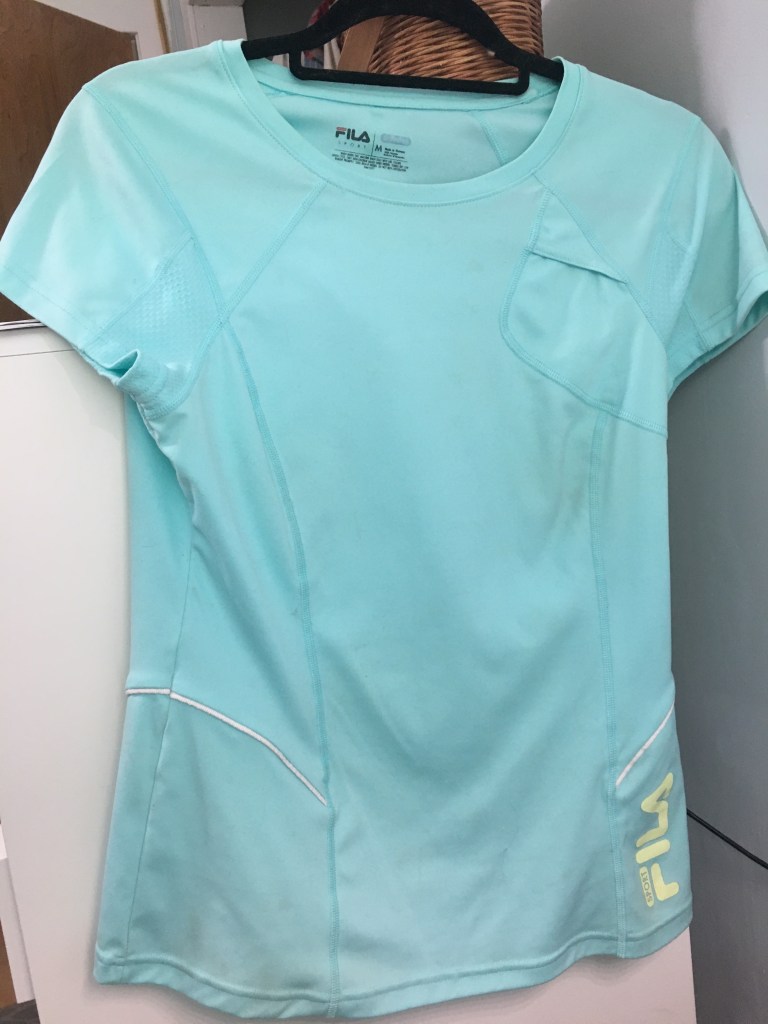
First up, color switching was necessary. As much as I loved the turquoise Kimono that the woman has on in the painting, none of my Kimonos come close. However, I did have a Fila sports top in the color that I wanted. Using my seventeen-year-old white embroidered blouse as an over-blouse (my Kimono replacement) all the “sporty stuff” on the Fila gets covered up.
I love this white blouse so much that if it ever wears out, I am determined to cut a pattern from it and make another because white embroidered cotton should be possible to find out there somewhere.
Turquoise contrasted against brown has to be one of my favorite color combos. Over the years, I have gotten a few walking shorts and decided to unearth this pair. I like walking shorts and think they can be semi-dressy or dressy enough to go out to my local wine Bristo with friends.
Those are the three pieces in my color-blocked outfit; the aqua sports top, white blouse, and brown Chico’s walking shorts.
Accessories

I couldn’t work red in my three outfit pieces but threw on my red quartz ring (eBay) for that because I did want some red somewhere. My cuff with the turquoise stones was a very lucky thrift shop find. The necklace is beaded with all three colors that I am wearing. Looking back, I seem to remember thinking about this necklace first. Not expensive, I’m pretty sure it either came from Wal-Mart or Target.
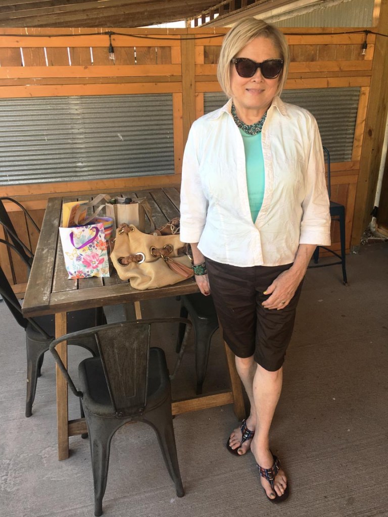
Extras are my bag, which is Michael Kors (from Zappos), and some Minnetonka sandals. The sandals probably aren’t perfect for this but I really like them and they do have turquoise, brown, and white (along with two shades of orange). And they are comfortable, and rarely get out of their box. I wanted to give them a few outings this summer.

Here’s a little more red! I did wear my creation out and felt very comfortable in it. It was very out-and-about appropriate for me so I wore it to dinner that we had with some of our best friends. Debby contributed a little more red with her wine. But, unfortunately, the rose was all looks and no fragrance. But it is still nice to have fresh flowers on the table.
OK, I think that’s about it for me.
I hope you find something in this work that inspired you and didn’t mind the small journey into the knitting universe. Send me what you come up with at meadowtreestyle@gmail.com along with a small blurb on how the work influenced your choices by tomorrow.
I will do a roundup this Wednesday featuring all your designs. I hope that “Strawberry Tea Set” has inspired you to put together something.
Take care everyone and stay creative!
I really need to make myself a real blue top this color. You can see why, when I wore it, I put a blouse over it.


I love how this look came together! The reveal of the athletic top was such a surprise…your white shirt totally covered all the extraneous sporty aspects of the top so well.
LikeLiked by 1 person
Thank you. It did remind how much I like Aqua and need to make a real top that I can wear without camoflage!
LikeLike
Terri, I love how you were able to style the athletic top for this outfit. The color blocking with these three colors is so good! I have always really liked browns and blues together and I really like your walking shorts. They look comfortable as well as chic. Your Minnetonka sandals and jewelry choices are very appealing to my boho heart, too! Great choice in artwork, too. I enjoyed learning about this artist who was previously unknown to me.
Shelbee
LikeLiked by 1 person
Thank you and I’m glad you like Childe Hassam. He has always appealed to me.
LikeLike
I love your interpretation, Terri! And, this artist really appeals to me…I love his subject matter as well as the watercolor look of the art. Unfortunately, I wasn’t able to pull together a look as so much of my clothes are packed! Hopefully, in a few weeks, I’ll be back at it!
https://marshainthemiddle.com/
LikeLiked by 1 person
Thank you Marsha, will be looking forward for you to get to play with us again!
LikeLike
Awesome interpretation! I adore the color of your Fila top. You created a lovely outfit, Terri. So glad it got to be worn on a real world dinner date.
Michelle
https://mybijoulifeonline.com
LikeLiked by 1 person
Thanks-that’s my one requirements for anything I put together-it has to be something that I could wear where I live. That means I feel comfortable in it.
LikeLike
The color of that top is a perfect match for the painting!
http://www.chezmireillefashiontravelmom.com
LikeLiked by 1 person
Thank you-I was glad I could cover the sport bits up.
LikeLike