

Welcome to my interpretation for this round of Style Imitating Art.
A Little Background
Style Imitating Art is hosted by Salazar of 14 Shades of Grey, Shelbee of Shelbee On the Edge, and me. Style Imitating Art challenges us to draw style inspiration from pieces of art. Every other Monday one of us selects an inspiration image and we each post the image on our blogs. The following Monday we share our art-inspired outfits. The following Wednesday, the curator shares all the submissions on her blog,
This Weeks Curator
Salazar picked this round’s work.

“The watercolor depicts Carl Larsson’s wife Karin, (born Bergöö), in the garden outside the home of Lilla Hyttnäs at Sundbornsån in Dalarna, a sunny day. It date seems to be 1908.
The watercolor was reproduced in Carl Larsson’s On the sunny side: a book about the dwelling, about children, about you, about flowers, about everything: outside the home, which was published in 1910. It contains reproductions of 32 paintings with text.”
“Here is Lisbeth, had just come back from England, in tailor-made dress with an attached WRECK OF A HAT.
She was sitting in my old leaky boat. Do not be deceived, it is not immediately taken after nature, she sits alone as a model.
I sat on the bridge, the afternoon sun was shining so pleasant, and just warm enough … and I was so sincerely happy to be having my beloved little girl back home.
On the other hand, the board is Karin along the beach and watching the fading melancholy of autumn’s very last flowers.
The next night they froze away. “
Carl Larsson is a Swedish illustrator and artist from the late 19th to early 20th centuries. He is mainly known for his family-based scenes. these usually featured members of his own immediate family (wife and children).
Growing up, he was extremely poor and underprivileged and it is amazing that he had the chance to become an artist. If you want to find out more, a short biography of his story is HERE.
My Take
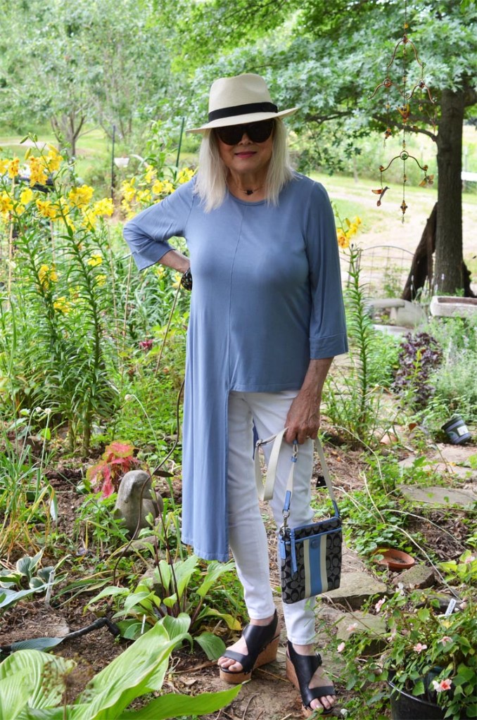
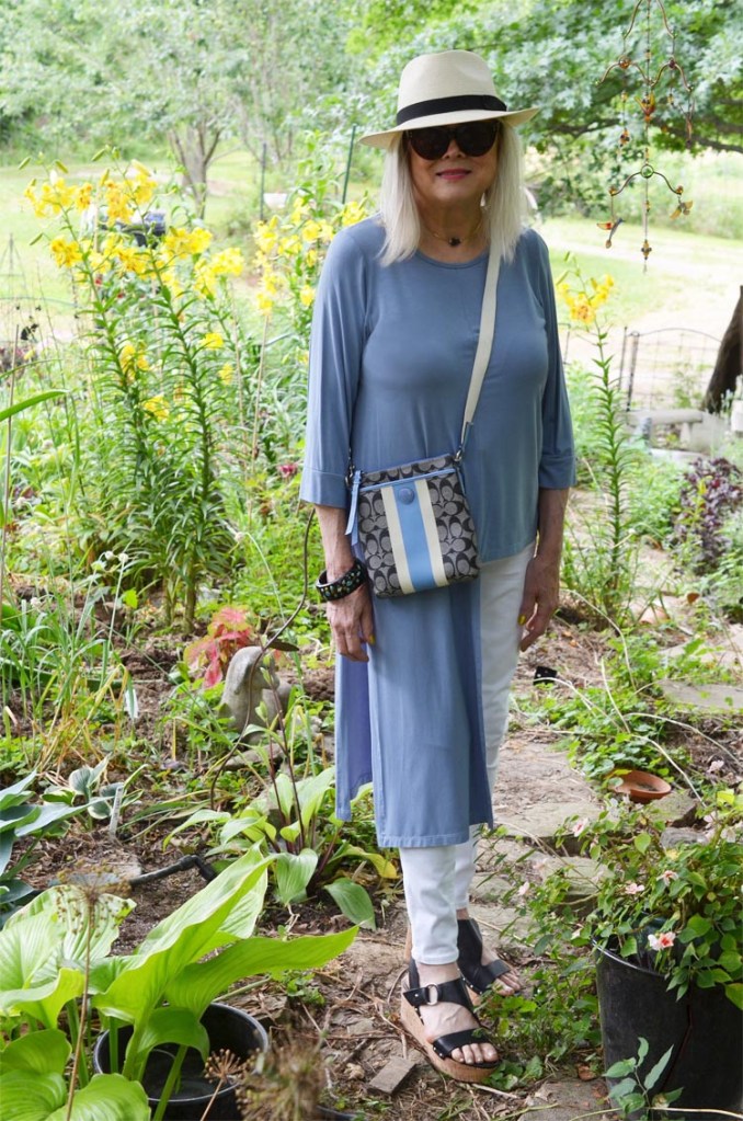
I chose to be inspired by Karin Larsson because she is in simple color blocks and, like me, probably had a lot of neutrals in her wardrobe. I just changed the proportion of the colors.
Dull Blue/White/Black
There could be some disagreement on whether her apron is a blue/grey or a grey/blue. I chose to go with the former. This top is by the American designer Rachel Riss. She has the Linear line, which is entirely made in America. “The Step Top”, is only available in powder blue which was all she also had back in Fall ’20, which is when I got mine. This “powder blue” seems to be slightly greyed to my eyes which is why I chose it for my inspiration and it does have the longer length in trying to emulate the apron.
A more pure shade of this blue is also in my Coach cross-body bag, along with some pure dark grey.
Karin’s main color is black. I chose it for just accents: my Marc Fisher sandals, the band on my Stetson hat, my resin bracelet, and finally in the design of my Coach cross-over bag.
On to White
I kept the white hat idea. However, rather than add an elaborate broad brim hat with elaborate decorations (which the turn of the century is known for), I am wearing my straw men’s Stetson. Also, I picked up white with my American Eagle hi-wasted jean jeggings.
Also, again, there is white represented in my cross-body Coach bag. I really can’t remember when I got this bag, but it has every color that I wanted in this style. Out of curiosity, I tried to find my bag on eBay and Poshmark. It seems to be called a “Swingpack” and I found a lot of different colors in the same style, especially on Poshmark, but not my exact one.
Jewelry
I kept jewelry at a minimum, just a small black and gold necklace, and a thrifted thick resin bangle.
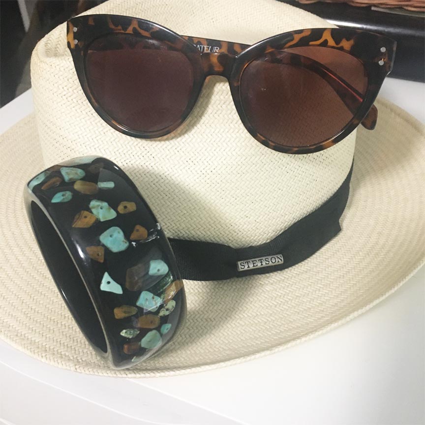
I just wanted to take a pic of my hat and included my bangle and sunglasses. The sunglasses really don’t have anything to do with recreating the painting but are the ones I’m mainly wearing this summer. I got them in my Spring Curateur (and last) box. They are by Saint Owen. Of course, being a collaboration with Curateur, they are not going to have the same quality as their “made in Italy” ones on their website.
I subscribed to Curateur for about a year and thought the box was pretty good. Of course, I’ve never done a subscription like this so really don’t have anything to compare it with. But, I thought a year was enough and it was time to stop.
Tying It All Up
There were a few ways to go with this painting. My heart leaned heavily towards the orange lilies in the painting. They are blooming everywhere around here during this time. However, nothing I had with orange completed a head-to-toe look like the one I finally put together.
That wraps it up for me so now it’s your turn.
I hope this art inspires you to create a look and that you will join us. Send a photo of your SIA-inspired outfit along with a small blurb on how you were inspired to Salazar whose email is 14shadesofgreyblog@gmail.com by tomorrow. She will share the submissions on her blog this Wednesday.
Anyone can participate and you certainly do not have to have a blog.
f you do share your inspirations on Instagram use the hashtag #StyleImitatingArt so we know you are there. You can also tag us in the images. Our Instagram names are @terrigardner_meadowtree, @14shadesofgrey, and @shelbeeontheedge.
Salazar will be putting together her review to be published Wednesday. If you have an entry, please send it to her at 14shadesofgreyblog@gmail.com by tomorrow. Hope to see you there!
Take care and style on!


Terri, this hi low top is so fantastic! And the color really is perfect for the painting. I like how you kept to a limited color palette with the lighter colors dominating for a cool summer look. The light blue and gray with white is so soothing and pretty. Your sandals are fabulous, too, and I absolutely love your Stetson hat! Great interpretation!
Shelbee
LikeLiked by 1 person
Thank you Shelbee-I am happy how it came out.
LikeLike
I love your look, especially the top. It’s unique. I had no idea this turn…
Have a lovely new week.
XOXO Reni
LikeLiked by 1 person
Thank you, I think I actually took the easy way out of this one.
LikeLiked by 1 person
Terri, that top is perfect! You put together such a wonderful outfit here even if you think it’s neutral. I love the how your purse pulls everything together! Love, love, love this look!
https://marshainthemiddle.com
LikeLiked by 1 person
Thank you Marsha. I glad you like it because I just don’t have to manly flower prints in my closet. They are all out in my garden!
LikeLike
I enjoyed this outfit with the cool serene colors and interesting silhouettes. The various elements really came together nicely for a great look.
LikeLiked by 1 person
Thank you. I usually have a fairly minimal style and sometimes so I think sometimes my approach is a bit different that others to fit what’s in my closet. I love flowers but don’t have to many flower prints in my closet so color blocking it was.
LikeLike
Terri, I love this look! And it’s a great take on the painting. I knew the moment I saw your outfit, you were being inspired by Karin if you had changed it up a bit. The-at powder blue is a great shade on you.
Michelle
https://mybijoulifeonline.com
LikeLiked by 1 person